Table of Contents
ToggleA blue accent wall transforms a living room faster than almost any other single project. It anchors the space, adds sophistication, and works with nearly every modern aesthetic, from minimalist Scandinavian to contemporary eclectic. Unlike trendy colors that fade from favor, blue has staying power: designers keep returning to it because it’s versatile, calming, and genuinely works. Whether someone’s planning a weekend paint job or considering a more involved design approach, the key is choosing the right shade and pairing it thoughtfully with existing furnishings. This guide walks through selecting blue tones, coordinating decor, and nailing installation so the finished wall looks intentional and polished.
Key Takeaways
- A modern blue accent wall transforms a living room by anchoring the space and adding visual depth without requiring structural changes or extensive renovations.
- Choosing the right shade of blue—from deep navy to soft powder blue—depends on the room’s natural light, wall orientation, and existing neutral furnishings.
- Pair your blue accent wall with a neutral sofa and complementary accent colors like warm coral or soft gold through pillows and decor for a cohesive, balanced look.
- Proper prep work including cleaning, patching, priming, and using quality painter’s tape ensures crisp edges and even coverage in two coats.
- Assess your room’s lighting conditions before committing to a blue shade, as warm artificial light makes blue appear muted while cool light emphasizes its intensity.
- Layer in plants, artwork with multiple colors, and strategic lighting after installation to make your blue accent wall feel intentional and prevent it from overwhelming the space.
Why Blue Accent Walls Work in Modern Living Rooms
Blue is the safest bold color choice for living spaces, it rarely clashes and almost always improves a room’s visual hierarchy. A single accent wall in blue naturally draws the eye, anchoring a seating arrangement or highlighting architectural features like a fireplace or built-in shelving. Unlike warmer accent colors, blue recedes slightly, creating a sense of depth and calm rather than aggression.
Modern interiors favor blue because it bridges informal and formal aesthetics. It works in a loft with exposed brick, a cottage with shiplap, or a sleek apartment with concrete floors. The color also pairs beautifully with neutrals (whites, grays, taupes) while complementing wood tones, metal fixtures, and textiles. From a practical standpoint, a blue accent wall can hide the awkwardness of an oddly proportioned room or offset dated trim without requiring structural changes.
Color psychology matters too. Blue is associated with calm, focus, and stability, qualities most people want in their living room. It encourages relaxation without feeling bedroom-like or overly cool when the right undertones are chosen. A well-selected blue accent wall improves the overall feel of a space within hours of installation.
Choosing the Right Shade of Blue
The difference between a stunning accent wall and a regrettable one often comes down to undertone and depth. Paint color depends on lighting conditions, wall orientation, surrounding finishes, and personal preference, what looks perfect on a sample chip may surprise when applied across 400 square feet. The best approach is purchasing small sample pints, painting large swatches on the accent wall, and observing them at different times of day.
Deep Navy and Midnight Blue
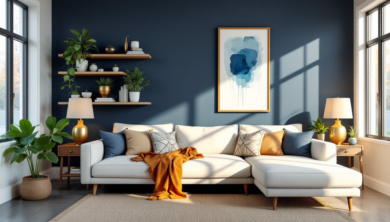
Navy and midnight blues work as statement walls in living rooms with good natural light and neutral surroundings. These shades ground a space and feel sophisticated without the flatness of pure black. They pair exceptionally well with warm wood (oak, walnut) and gold or brass fixtures, creating a modern-traditional vibe. Dark blues demand adequate lighting: in rooms with single north-facing windows or limited artificial light, they risk feeling cave-like. If choosing a deep blue, ensure the room gets 4+ hours of natural light daily, or plan to layer in task and ambient lighting. Navy works particularly well if the accent wall is behind a sofa or opposite a fireplace, where it becomes a visual anchor without overwhelming the entire room.
Soft Powder and Sky Blues
Lighter blues, think powder, sky, or periwinkle tones, offer boldness with gentleness. They work in smaller rooms, north-facing walls, and spaces where the designer wants color without drama. Soft blues pair beautifully with crisp whites, soft grays, and natural textures like linen and jute. These shades are forgiving: they’re less likely to feel oppressive if the room’s lighting isn’t ideal. A powder blue accent wall can make a compact living room feel larger because the color doesn’t advance visually. Sky blues work well in cottages or spaces with lots of white trim. Keep in mind that very pale blues can read as washed-out without the right surrounding colors and finishes, they need crisp accents (white frames, metal hardware) to avoid looking flat or dated.
Furniture and Decor Pairings for Blue Accent Walls
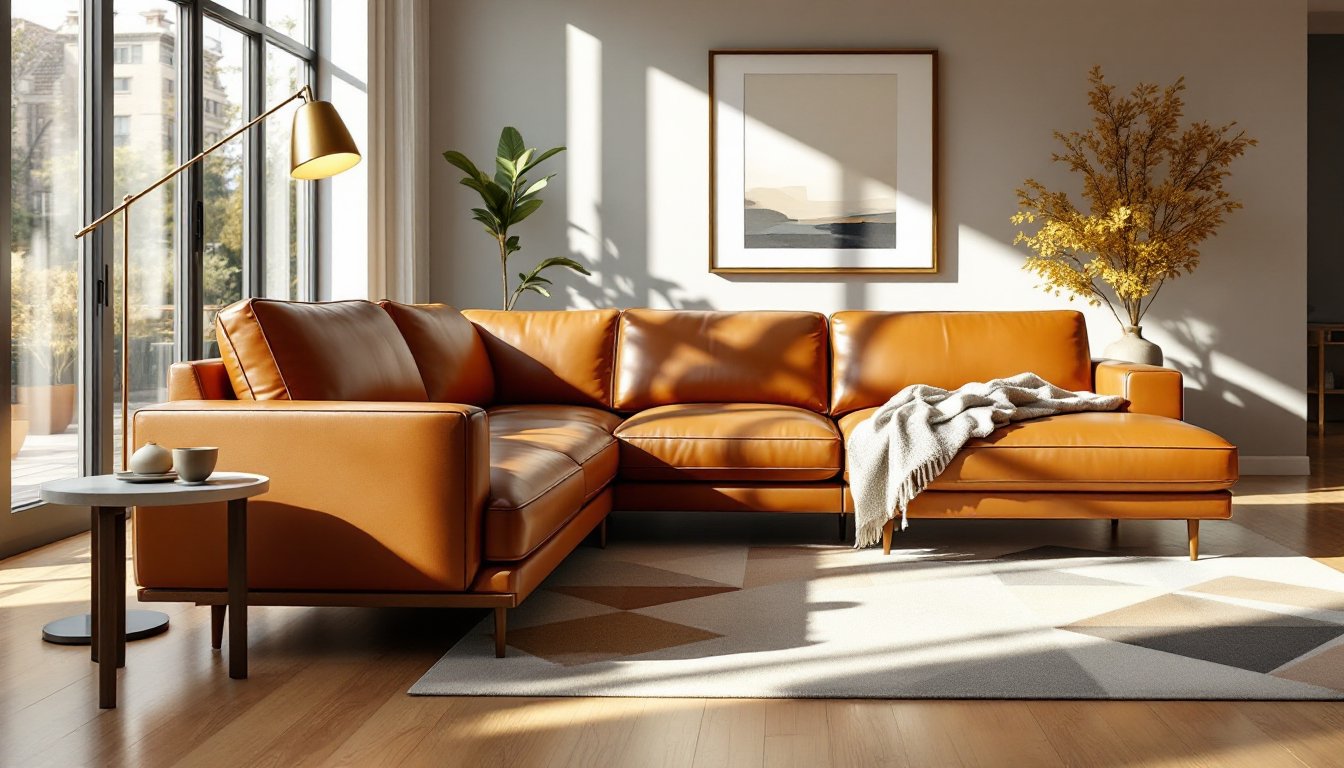
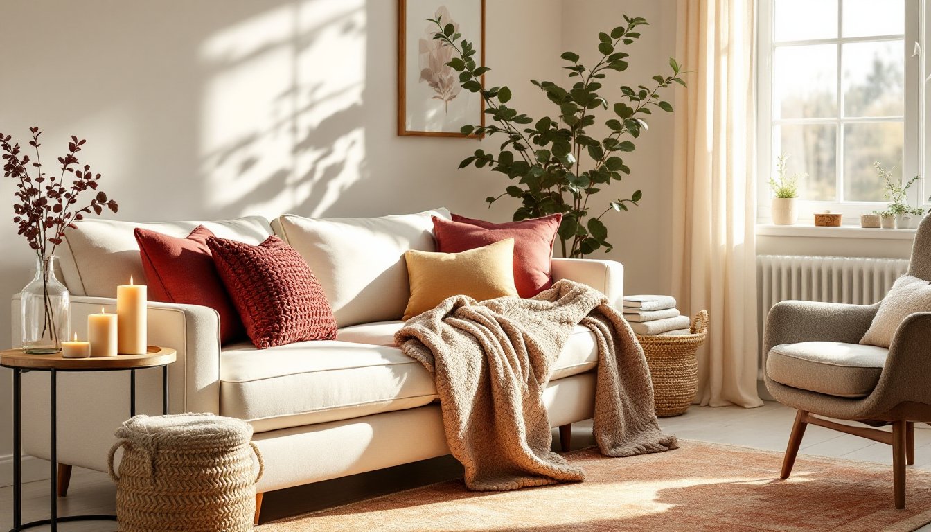
A blue accent wall sets the tone, but the surrounding furnishings and decor determine whether the room feels cohesive or chaotic. The sofa color is critical. Neutral sofas (cream, gray, taupe, or white) are the safest choice and allow the blue wall to dominate without competing for attention. If the designer prefers a darker sofa, charcoal or greige works, but avoid other bold colors directly opposite the blue wall, it creates visual conflict. A mid-tone gray sofa bridges formal and casual, letting the blue shine without the space feeling sterile.
Throw pillows and blankets offer controlled color play. Complementary accent colors like warm coral, soft gold, or burnt orange add energy without overwhelming the room. Geometric or patterned pillows can echo the blue while introducing secondary colors and visual interest. Avoid scattering too many colors: restrict the palette to the blue wall plus two complementary tones and neutrals.
Artwork and wall décor should acknowledge the blue without repeating it endlessly. A large print with blue as one color among several works. Metal or natural wood frames feel modern and keep the focus on the art rather than the frame. Floating shelves with books, plants, and decorative objects in whites, greens, and metallics create depth and texture against the blue.
Flooring and rugs are foundational. A light gray or neutral rug grounds the seating area and prevents the blue from dominating vertically. If flooring is dark wood or concrete, a warm-toned natural fiber rug (jute, sisal) balances the cool blue. Plants and greenery are visual relief against blue walls: they add freshness and life, making the space feel intentional rather than merely bold.
Lighting Considerations and Installation Tips
Paint color shifts dramatically under different lighting. Warm artificial light (2700K color temperature) makes blue appear more muted and slightly greenish: cool artificial light (4000K or higher) emphasizes blue’s intensity. Assess the room’s primary light source before committing to a shade. North-facing walls receive cool, consistent light and show blue’s true color. South-facing and east-facing walls receive warm sunlight, which can shift blue toward teal or cyan. West-facing walls get intense afternoon sun that warms colors significantly.
For installation, prep work determines the final result. Clean the wall thoroughly with a damp cloth and allow it to dry completely, dust and grime prevent even paint adhesion. Patch any holes or damage with spackle, sand smooth, and prime with a neutral primer. Use painter’s tape along the top, bottom, and sides of the accent wall: edge it carefully for crisp lines. A quality tape held at a 45-degree angle and pressed firmly prevents paint seepage.
Choose quality paint, flat or matte finishes hide imperfections but show wear: satin or eggshell finishes are more durable and easier to clean. Most modern blue accent walls require two coats for even coverage. Apply the first coat in thin, even strokes, allow it to dry per manufacturer instructions (typically 2-4 hours), and apply the second coat. Don’t skip priming: primer prevents bleed-through on older walls and ensures color accuracy.
Lighting after installation is equally important. If the accent wall feels too dark or intense, add a floor lamp or picture light directed at the wall to balance brightness. Conversely, if a dark blue appears muddy, brighter ambient lighting clarifies it. Dimmers are invaluable for adjusting mood and preventing the blue from feeling overwhelming at night.
Conclusion
A modern blue accent wall is an achievable project that delivers dramatic visual impact without requiring structural work or permits. Success hinges on choosing the right shade for the room’s light conditions, preparing the surface properly, and coordinating furnishings thoughtfully. Whether selecting deep navy for drama or soft sky blue for subtlety, blue remains one of the most forgiving and sophisticated accent wall colors. Taking time to sample colors and plan the surrounding décor ensures the finished room feels intentional and current.